candle sticks chart
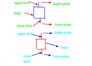
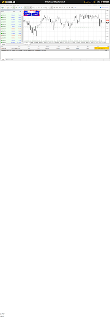
-A candlestick chart is a style of financial chart used to describe price movement of a security, derivative or currency.A candlestick is made up of a body, an upper stick and a lower stick.It consits of two markets,a bear market and a bull market. In a candlestick chart, candlesticks do appear in two pairs of color,white and black or green and red.White and green indicates a bull market which means one should buy while red and black indicates a bear market which means one should sell. Here is how it looks like; -From the above image of the candle,the blue candle stick indicates a bull market while the red candlestick indicates a bear market.In a bull market,one is supposed enter a buy position while in a bear market one is supposed to enter a sell position.In both cases,there is high point and low point.In a bull market,one should enter the buy market from the low point and close the market at the high point while the bear market,one should enter the market from the hi...