-A candlestick chart is a style of financial chart used to describe price movement of a security, derivative or currency.A candlestick is made up of a body, an upper stick and a lower stick.It consits of two markets,a bear market and a bull market. In a candlestick chart, candlesticks do appear in two pairs of color,white and black or green and red.White and green indicates a bull market which means one should buy while red and black indicates a bear market which means one should sell. Here is how it looks like;
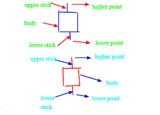
-From the above image of the candle,the blue candle stick indicates a bull market while the red candlestick indicates a bear market.In a bull market,one is supposed enter a buy position while in a bear market one is supposed to enter a sell position.In both cases,there is high point and low point.In a bull market,one should enter the buy market from the low point and close the market at the high point while the bear market,one should enter the market from the high point and close it at the low point.
FOLLOWING CANDLESTICK PATTERN
-While using a candlestick chart to trade,there is a trading pattern that it normally forms.This pattern is called a trending pattern and this is when one is supposed to enter the market.The trending pattern can either be downward trend or an upward trend.For an upward trend pattern,one should enter a buy position while for a downward trend,one should enter a sell position.Here is how the trending pattern looks like;
 |
| upward trend |
 |
| downward trend |
-From the diagrams above,there is two trending candlesticks charts.One is an upward trending while another one is a downward trending.The upward trending candlestick charts has green color trending upwards thus indicating that one should enter a buy position while the downward trending has red color trending downwards thus indicating that one should enter a sell position.


Comments
Post a Comment